This was a fun challenge! I had worked with Doc in the past on another logo project and for this one, he wanted to create a highly-detailed logo mark for his new scuba diving company.
The first thing I did was come up with some sketches, based on a series of words that represented the company: Diversity, Community & Timeless Warrior. I did some research and came up with a handful of sketches to present.
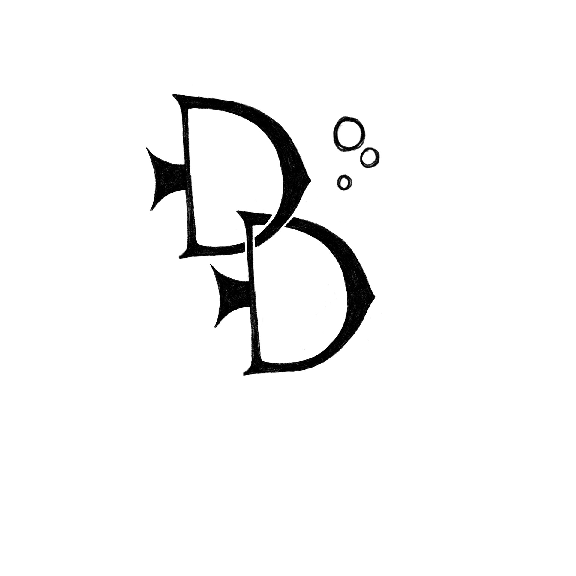
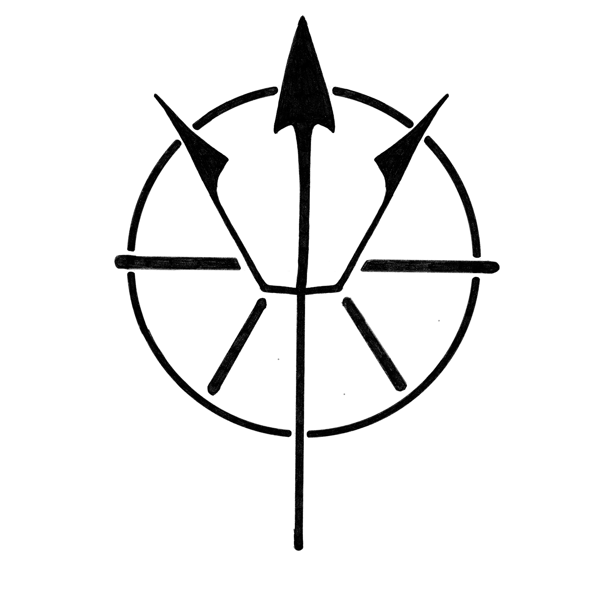
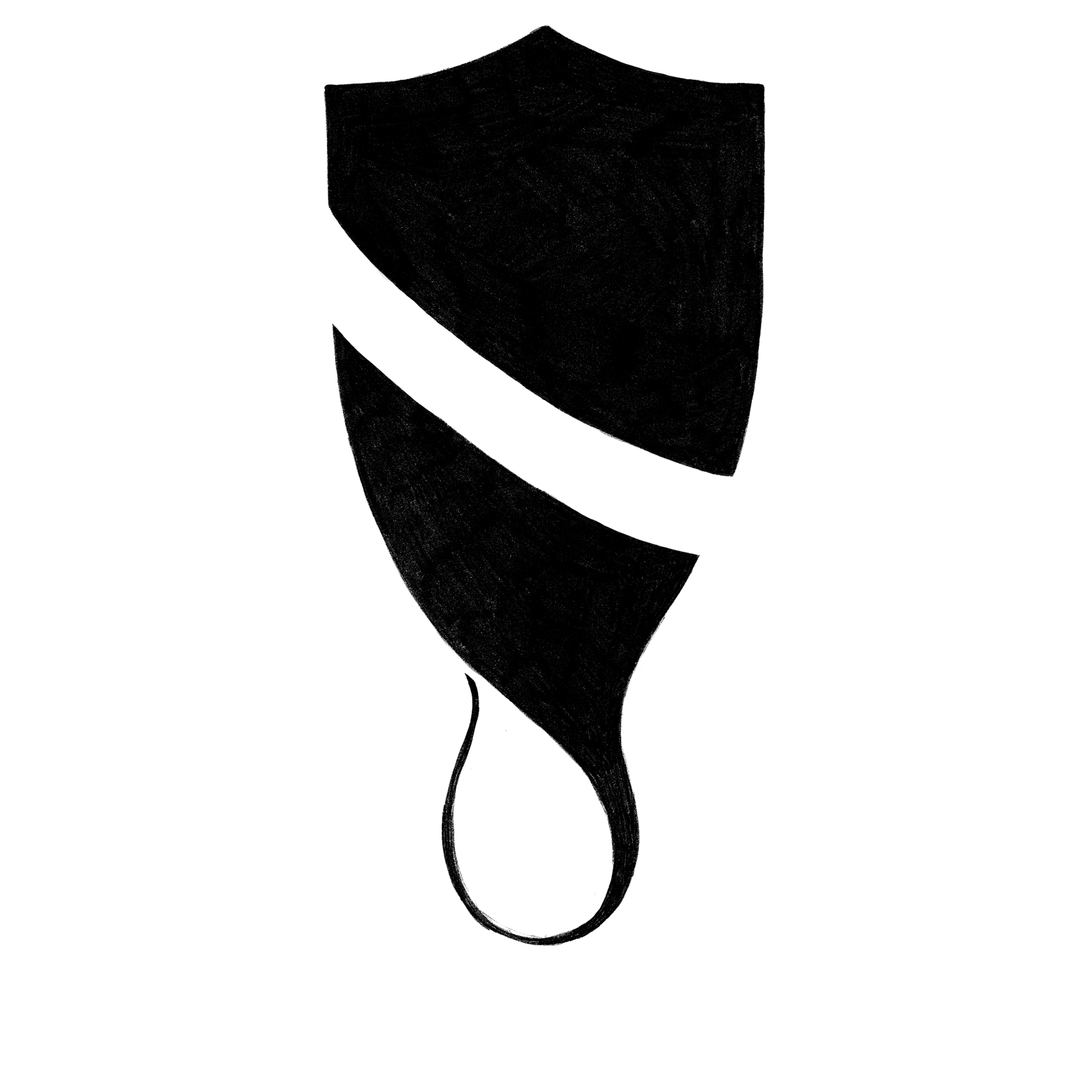
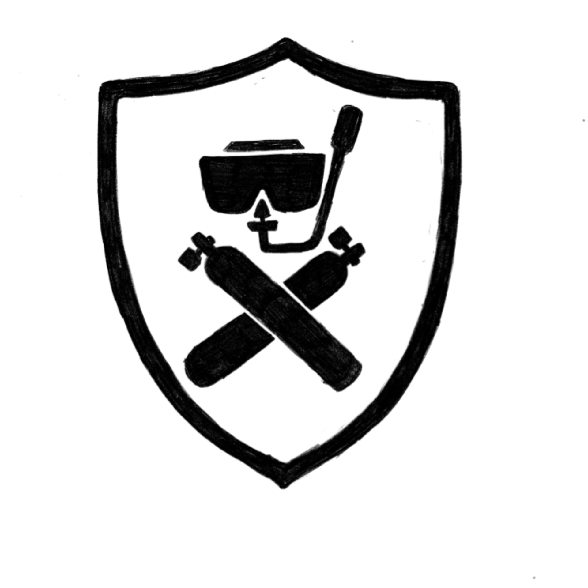
Doc really liked the sketch of the shield that curved at the bottom into the base of a flipper but wanted to take that concept a little further. We tried having a stingray with it's tail curled up to form the base of the flipper, and a caduceus.
With the concept locked, we tried out some color combinations and type styles before landing on what would become the final logo. All elements were built in Illustrator to start, but were then drawn over in Fresco on an iPad to give a hand-drawn feel. The font was rebuilt with a 3D extrusion and everything was colored and shaded by hand.
This is a very different method of logo design than I was used to but it was fun to try a new process. I'm really happy with the end result and the little logo sketches I did during that stage of design reinvigorated my love for sketching.
